Custom CSS variables
So-called Custom CSS variables, which can be set for each elementary component used in a dashboard, can be used to define even more deeply how the respective elements should be styled. This greatly expands the customization options through the use of themes.
Basic principle
Custom CSS variables can be defined in a dashboard and can be applied at different levels:
- Dashboard level: Global variables that apply to the entire dashboard.
- Page level: Variables that only apply to a specific page.
- Panel level: Variables that apply only to a specific panel.
- Template elements: Variables that only apply to a specific element.
The Custom Variables are assigned in the Dashboard Designer and can then be used in Themes to centrally control the styling of the elements.
Example use case: Custom variables for button theming
Normally all buttons across the themes receive the same CSS style. However, there may be cases where you want to display different categories of buttons on your dashboard with different styles, such as a different background color. In our example, important buttons should be marked as “Primary” with a strong color and less important buttons should be marked as “Secondary” with a lighter color.
Here you can use your own custom variables to differentiate and integrate them into the theme. How to do this is shown in the following steps:
Procedure
-
Creating a Dashboard
Start by creating a new dashboard, see Mini-Tutorial: Build a Simple Dashboard. -
Adding template elements or creating new elements
Add existing template elements to your dashboard or create new ones, see Create template.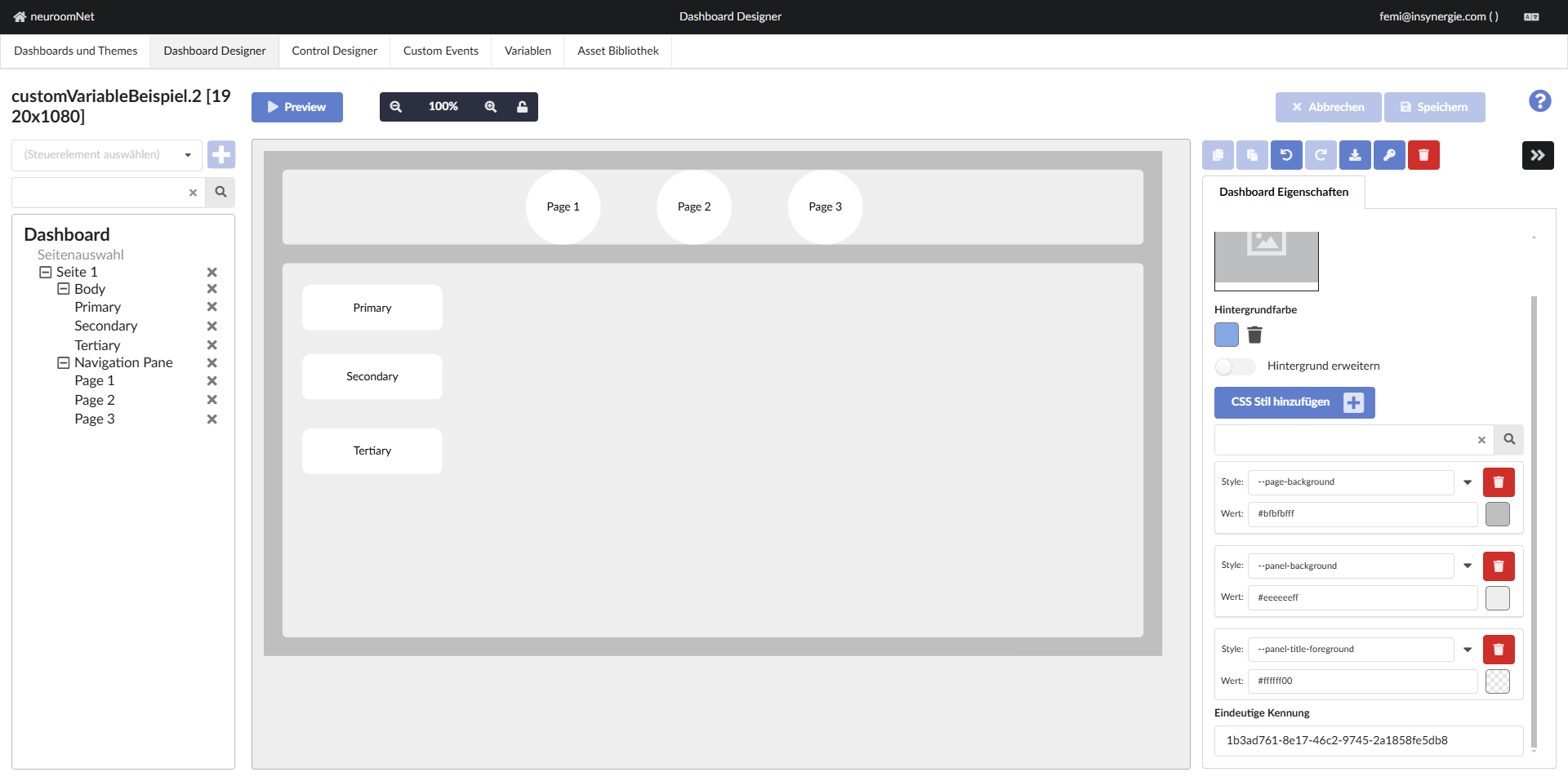
-
Assigning Custom CSS Styles
In the Dashboard Designer you can define custom CSS styles and assign variables, these variables can be referenced in your CSS styles, providing a flexible way to control styling. These can be done at the level of the dashboard, the page, the panel or the individual template elements.The syntax for defining a custom variable is:
--variable-name: value;Example for the definition of a custom variable:
--button-primary-color: #e74c3c; -
Use of the custom variables in the CSS styles of the buttons: You reference the custom variables in the CSS styles of the buttons using the
var()function without assigning them a value at this point. The actual definition of the custom variables takes place later in the “Dashboard and Themes” tab (see point 5).--button-background: var(--button-primary-color)
--button-hover: var(--button-hover-color)
--text-text-foreground: var(--button-text-color)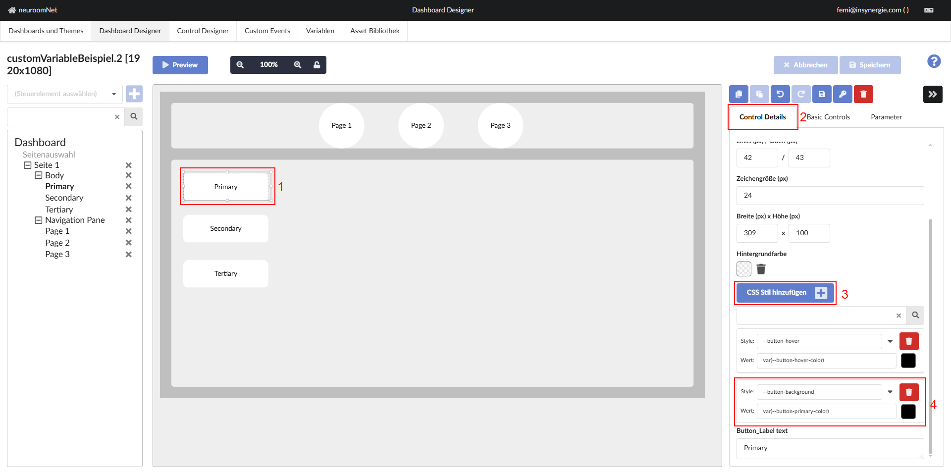
This process should be repeated for the button background for the “Secondary” and “Tertiary” buttons.
- Secondary Button: var(--button-secondary-color)
- Tertiary Button: var(--button-tertiary-color)
Note: One should periodically save the dashboard while making changes. Saving the dashboard, especially before switching to the Dashboards and Themes tab, ensures that styling via themes uses the most current version of the dashboard.
-
Create or update a theme with the new variables
Go to Dashboard and Themes to create a new theme or update an existing one. Here you can define the values of the custom variables centrally.Example:
In the theme you define the actual color values:
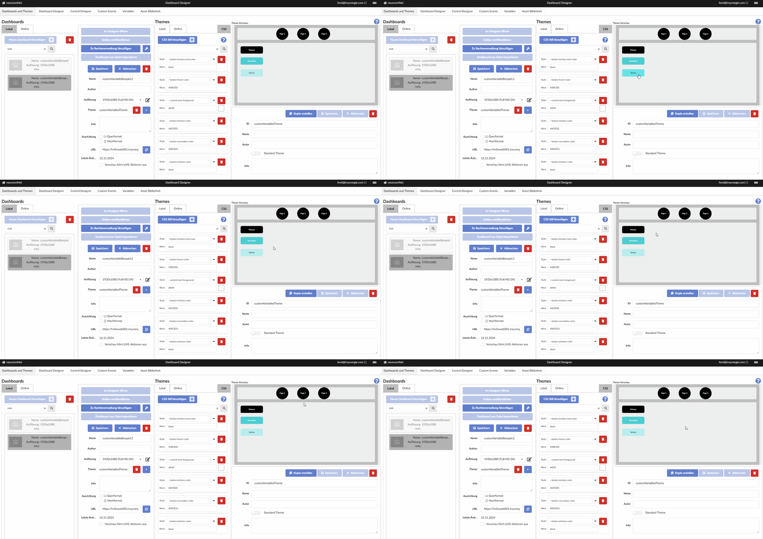
--button-primary-color: black
--button-secondary-color: #00CED1
--button-tertiary-color: #AFEEEE
--button-hover-color: #38E5E8
--button-tertiary-text-color: black
This will adjust the background color of all elements that use this variable.
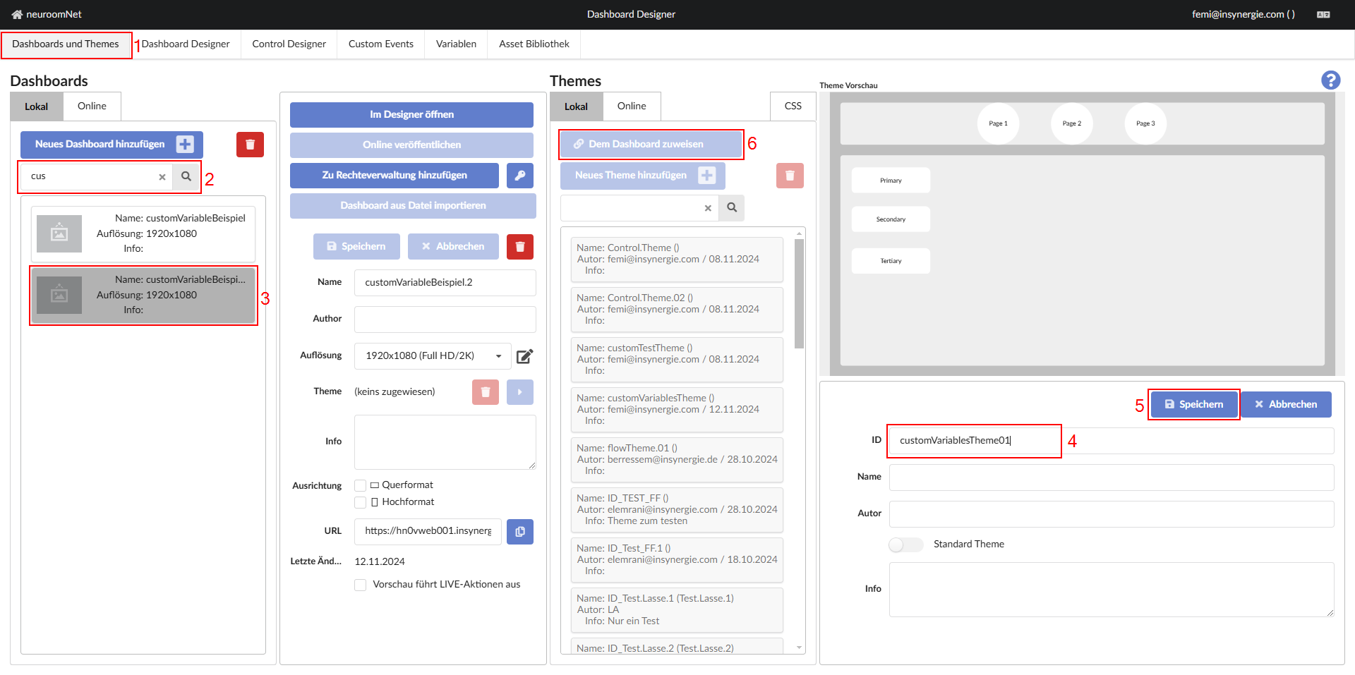
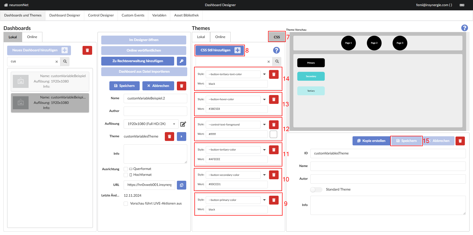
Note: Some variables in the image above were not explained previously to reduce the complexity of the tutorial. Below is a brief overview of the additional variables and their functions:--control-text-foreground: This is one of the built-in custom variables that adjusts the color of the text elements in the dashboard.--button-hover-color: This is another built-in custom variable that sets the background color of buttons when the mouse cursor hovers over the button in the dashboard.--button-tertiary-text-color: This is a custom variable defined specifically for this tutorial to ensure readability of the text on the tertiary button. The previously mentioned variable *--control-text-foreground* sets the color of all text elements in the dashboard to white, however this custom variable is only applied to the text element of the tertiary button, so that the text has better contrast with the button and is easier to read.
