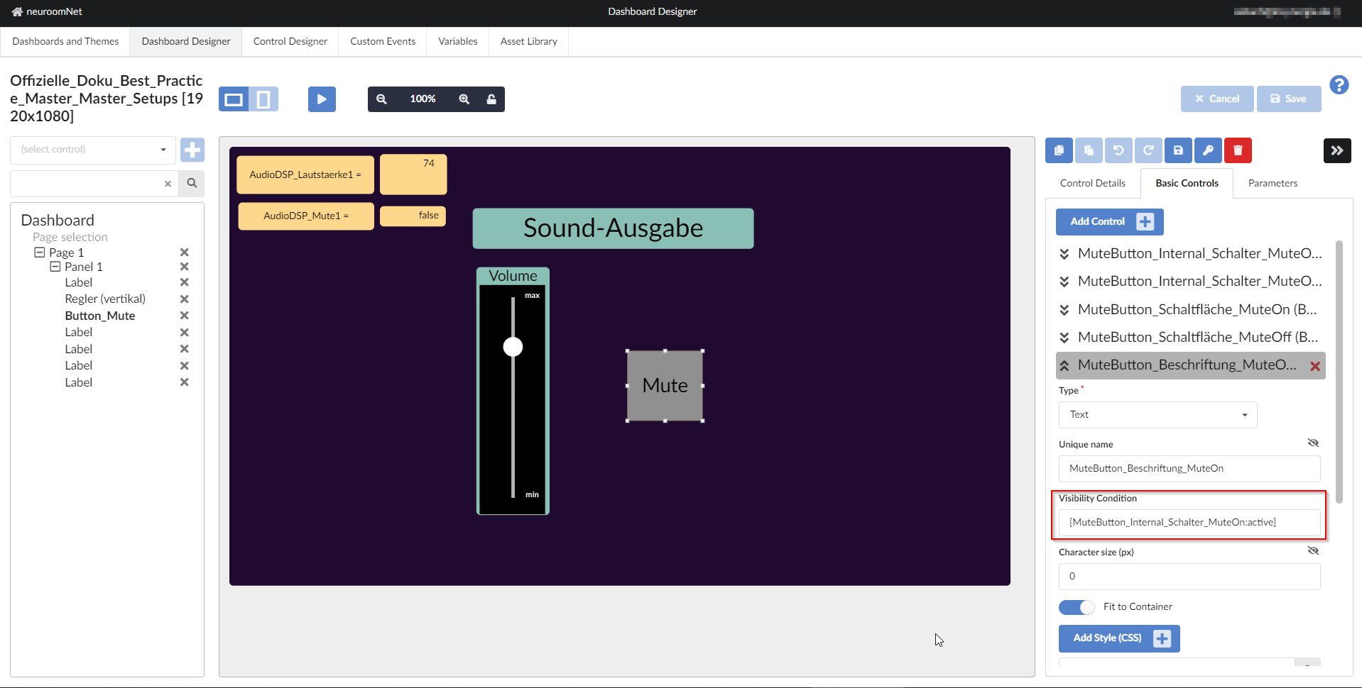
Visibility Conditions
This page has been automatically translated and has not been reviewed in detail yet. Therefore, the translation might not be completely accurate.
So-called visibility conditions, which can be set for each elementary building block installed in a dashboard, can be used to define when and under what circumstances the respective elementary building block should be visible in the dashboard:
For a concrete example to inbes. Visibility conditions, see [Dashboard example / How-To: Creating a control that automatically changes its appearance and possibly behavior depending on the values of global variables](../../../nrn-guides-examples-bestpractices/ guide-shapeshiftingdashboardcontrol/index.md)
Below is a more technical explanation from the inventor:
Basic principle: Controls in a template (!) can be based on the status
- visible *hover
- pressed
- active
- inactive
- enabled
- disabled
other controls in the same (!) template can be hidden.
The visiblity condition follows the pattern:
\[BUTTON:active\]
There is always CONTROL:state and !CONTROL:state, so !BUTTON.pressed.
The entire syntax is, e.g. \[C1:pressed,!C2:hover\],\[C3:active\],... ==> (C1:pressed OR NOT C2:hover) OR (C3:active) OR .. .
\[C1:pressed+!C2:hover\],==> (C1:pressed AND NOT C2:hover)
The values for the state are active, hover, pressed, enabled, disabled, inactive.
So !BUTTON:pressed.
For active there are inactive and disabled for enabled.
pressed and hover have no counterpart, you have to ! use - you will probably need it VERY rarely if you arrange the layers correctly, but it can be.
[!BUTTON.pressed] NOT ![BUTTON.pressed]
The effect is ultimately a multi-layer technology, which of course also works for text etc.
Crossfading is not intended at first, we don't work with opacity:0 but with display:none.