Styling and theming on the dashboard
This page has been automatically translated and has not been reviewed in detail yet. Therefore, the translation might not be completely accurate.
Introduction
Before you get started, you should familiarize yourself with the structure of a dashboard (see chapter Components of a Dashboard). When styling, there are therefore different target components to which settings could be applied:
- Elementary building blocks
- Templates
- Controls (copies of templates)
- Areas
- Pages (also the page selection)
- Dashboard
In addition, there is a corresponding inheritance of the background color set in the dashboard to all pages where this is not explicitly specified and from there to all areas etc.
In addition, there are different types of settings that should behave differently with regard to inheritance. Let's take a look at a simple template that only contains the basic building block for displaying text without interaction.

Without further configuration, this has a transparent background, as the block is intended to be combined with other elementary blocks to form a template. The text color itself is black by default and can be adjusted using the CSS properties.

Instead of directly changing the CSS color property, it is also possible to use the CSS styling variable --dashboard-text-control-text-foreground.

If only a single Text building block is to be adapted, it makes no difference which CSS property is used. However, --dashboard-text-control-text-foreground could also be set on an area, a page or the dashboard itself and would then automatically be valid for all Text modules.
And that’s the basic concept of styling and theming dashboards in neuroomNet! But before we get into the details, a few more basic thoughts on a slightly expanded example.

The obvious properties (there are of course many more, at least from a CSS perspective) are:
- No frame, but the corners are rounded
- Character set, size, color and style
- Text centered
- Padding around the text
For general styling, it must be decided which parameters can be set and overwritten on which shape. This is then grouped across all elementary building blocks and perhaps even makes sense. For the styling itself, the inheritance of fixed CSS parameters is provided with CSS variables (Custom Properties, -- prefix) to work. Some settings can currently also be accessed via the configuration, for example of the template - making them very difficult to overwrite dynamically.
The current status (October 27, 2020) will be presented using a simple example of the non-interactive test.
Frame and rounding
After an initially different approach, the type of border and rounding of the corners is now determined by the control on the dashboard. In particular, there is no concept in this regard for the elementary building blocks or the template itself: basically everything here is without a frame and is rectangular, which is intended to make it easier to build templates based on the building blocks. Of course, an appropriate CSS configuration can be made at any time, but there is no concept of allowing styling or even theming from outside (control, area, page, dashboard).
Frames and rounding are set using CSS variables and can therefore also be inherited from a theme:
- --dashboard-control-border, default none
- --dashboard-control-border-radius, default 10px
Analogous settings are also available for the following areas:
- --dashboard-panel-border, default none
- --dashboard-panel-border-radius, default 10px
Character set
There is no special mechanism for selecting the character set (font-family), but rather the usual inheritance mechanisms of CSS are used. In general, it should be enough to select this using a theme or to specify it on the dashboard - using several different fonts on a dashboard can make the look quite uneven.
Text style
For the style of the characters (font-style and font-weight), basic inheritance makes little sense and there is no explicit setting. Similar to the character set, settings must be made directly in the CSS. Theoretically, requirements such as “all non-interactive texts are bold” are of course conceivable. If this is not a rare exception, you can still submit the corresponding settings later.
Text color
For the text color (CSS color) and the completeness of the color of the background (CSS background) of a text, CSS variables are used, which can then be overlaid using a variety of mechanisms.
- --dashboard-control-text-foreground, default #000000
- --dashboard-control-text-background, default transparent
There are additional settings for the optional heading of an area:
- --dashboard-panel-title-foreground, default #000000
- --dashboard-panel-title-background, default transparent
- --dashboard-panel-title-separator, default #ffffff
Character size
With the size of the characters (CSS font-size) it is a little trickier. Currently this is explicitly set in pixels for each control (taken from the template). All elementary building blocks use this size or an individually explicitly defined size in pixels for themselves.
Scaling a control via the character size is therefore almost impossible. In the original approach, only the character size for the template was defined absolutely in pixels and all other information was specified relative to this (i.e. in em). This included both the character sizes of the elementary building blocks (e.g. as 0.5em) as well as all dimensions and positions. However, specifying a width of 10em for 240 pixels with a character size of 24 pixels was considered too confusing, so that currently all information in a template is absolutely in pixels.
A template can therefore generally only be used in the context for which it was created - i.e. a template optimized for FullHD cannot simply be used in a mobile environment without modification. However, it is by no means certain that when using relative information (em), the associated automatic scaling when changing the character size would produce a decent result.
Styling or theming of the character size is currently not planned.
Paddings
No general CSS variable is used for the padding, as this can vary greatly from elementary building block to elementary building block. For the non-interactive texts this is something like:
- --dashboard-text-control-padding, default 0.5em
Styling a type of elementary building block
It is a challenge to change all types of elementary building blocks in the same way. Although all elementary modules use certain CSS classes in their display, the styling/theming of the dashboards is based on a simple assignment of CSS properties - a class hierarchy via selectors is not provided.
In the current concept, at least settings available via CSS variables in the styling/theming are intended to be overwritten by a similar variable. The following example:
- If --dashboard-control-text-foreground is not set, #000000 is used as the default setting (CSS color) for all texts
- If --dashboard-control-text-foreground has a color value, this will be used for all texts
- To use the same color for non-interactive texts, for example, simply use --dashboard-text-control-text-foreground
- Of course, the CSS color for an elementary block can be fixed via the CSS properties of the block independently of these general settings
Colors from the theme
In addition to CSS styling information, a theme currently also contains a list of colors that can be set via CSS variables of the type --dashboard-theme-color-1, *--dashboard-theme-color-2 * and so on can be accessed. Automatic color assignment, for example based on the order of controls or based on random assignment, is currently not implemented.
Elementary building blocks
Each elementary block is described with its settings in a separate document. The description is limited to the values relevant for styling and theming.
- Interactive Panel
- Switch
- Regulator
Areas
For areas, the following CSS variables are offered for styling and theming, which have not been mentioned so far:
- --dashboard-panel-title-foreground, default #000000: Color (CSS color) of the title.
- --dashboard-panel-title-background, default transparent: background (CSS background) of the title.
- --dashboard-panel-title-separator, default #ffffff: Color (CSS border-bottom-color) of the title underline.
Background colors
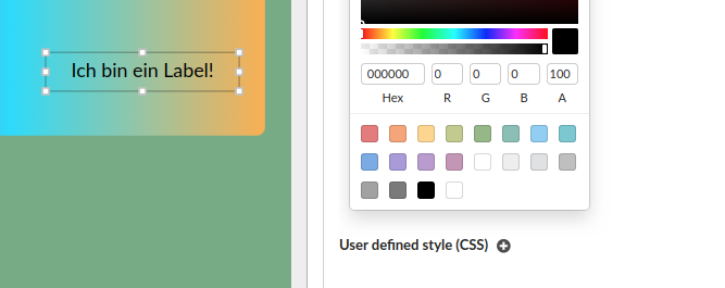
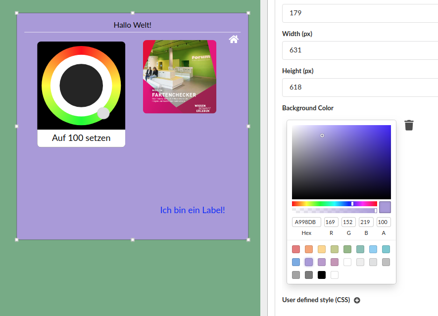
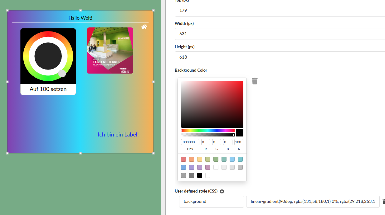
The background color of the dashboard, page and area can be set explicitly. Colors can optionally be used with transparency via direct selection; the CSS properties must be maintained directly for color gradients.


Basically, all backgrounds are transparent, so it is advisable to set a background color for at least the dashboard itself - only in the productive display a dashboard has a white background.
What is a theme?
As mentioned, a theme initially provides any number of colors that, if configured correctly, can serve as a switchable palette for a dashboard or page - areas and controls currently do not use their own themes.
In addition, any list of CSS properties can be defined in a theme, which are then displayed as default values at the corresponding level (dashboard and page). However, following the concepts in this document, it actually only makes sense to define the CSS variables here that are also evaluated - perhaps the character set font-family and other very general CSS properties that make sense in all places.